This blog post was written at the conclusion of the 2015 PatronManager Community Meeting, as a follow up to a presentation I did with Caroline Renard about using the Salesforce1 mobile app. Nothing here is PatronManager specific.
So you want to get started with the mobile app. Your executive director downloaded it to his phone and declared it useless. You know how to find contacts in it…but you don’t actually do it. Let’s dig in and talk about some techniques and things you need to know in order to make Salesforce1 useful to your organization and to drive user adoption.
First, we’ll dig in to Page Layouts, and making sure you can see the most important things about a Contact right away. Then, we’ll discuss Actions, and what you can do with a Contact.
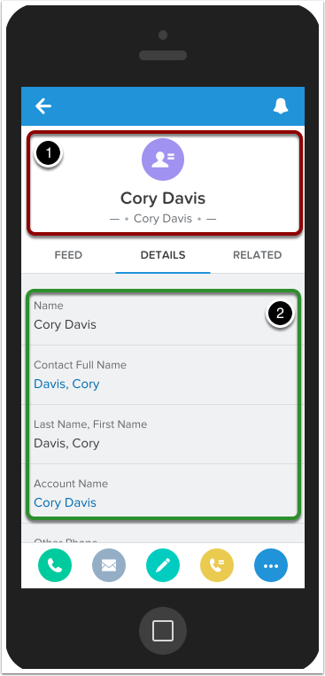
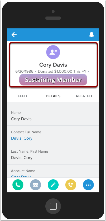
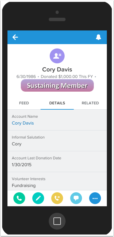
A Normal Contact
You may have noticed that when you log in to Salesforce1 and look up a Contact, you don’t see a lot of very useful information about that contact! This might be why your ED finds the app useless. We’re going to want to customize what’s happening here.
The Salesforce1 Contact Record is split into two sections:
- Compact Layout
- Details Tab
Here, our default has the Contact name twice in the Compact Layout, and then another FOUR TIMES in the Details Tab. Now, remembering someone’s name can be difficult but this is just overkill. No wonder people aren’t using this dang app!
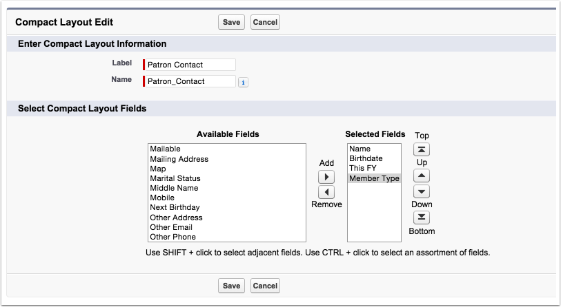
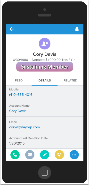
A Better Compact Layout
The easiest place to start is with a better Compact Layout. You can pick three fields to show underneath the name that will give you important details about the Contact. In this case, we chose:
- birthdate (so you know what cultural references are safe to make when talking to them)
- what they donated so far this year (so you can target how much more to ask for)
- and their membership type (because badges look great in Compact Layouts)

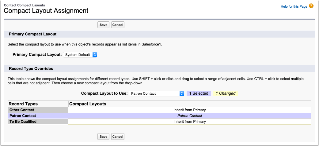
Compact Layout Setup
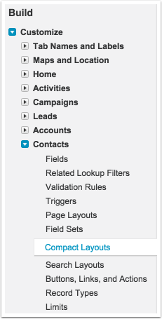
To set this up, we’re going to have to go back to our desktop computer and get into the setup section of Salesforce. Every object has a compact layout setting, so let’s navigate to the section for Contacts!
Build a Compact Layout
Once you’re there, you’ll notice there is just a system default. We want to create a new compact layout for our Patron Contacts. Just hit new, give it a name, and start dragging fields over. You’ll notice you can add more than just 3 fields after the name. Only the first three will show up in the mobile app. Compact Layouts are used in related lists too, where more than three fields can show, but on the top of the record page? Just three.
In this case, “This FY” is a formula field to display their annual giving nicely, and “Member Type” is a formula that shows the right badge for a contact. If you’re a PatronManager client, you can reach out to your client administrator to create these badges. You can also read about how to do it yourself in this article from Caroline Renard.
Compact Layout Detail
Once you hit save, you’re going to need to assign the Compact Layout, otherwise you won’t ever see it!
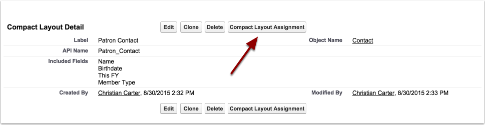
Assign the Layout
Here, we just reassign the layout for “Patron Contact” type records. You can set a Compact Layout for each record type, but unlike normal page layouts, you cannot set different Compact Layouts based on user profile. Reassign the Patron Contact record type to your new layout, and hit save.
Now that’s better…
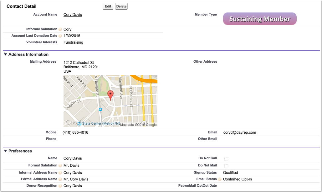
Refresh the app on your phone, and see your new compact layout come to life. However… that details tab still has a lot of repetitive and useless information. You can scroll down to find the information you need, but this is really just a waste of space.
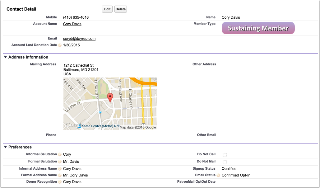
Look through setup and you’ll notice you can’t find a section for “detail tab layout”. Instead, this layout will be based on your normal desktop page layout!
A Better Page Layout - Mobile
Here, we’ve adjusted the page layout to contain more key information up at the top, to minimize scrolling on mobile.
A Better Page Layout - Desktop
This DOES involve changing the layout on desktop as well! Plan these changes strategically and be clear to your colleagues that you’re going to be rearranging their normal page layout. Nobody wants a freak out when they can’t find key fields anymore.
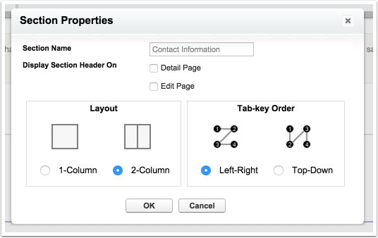
Page Layout Follows the Tab Order
It’s important to note that the way fields will display on mobile follows the “tab-key order” section property. When Top-Down is selected, all the fields in the left side of the section will appear above the fields in the right side.
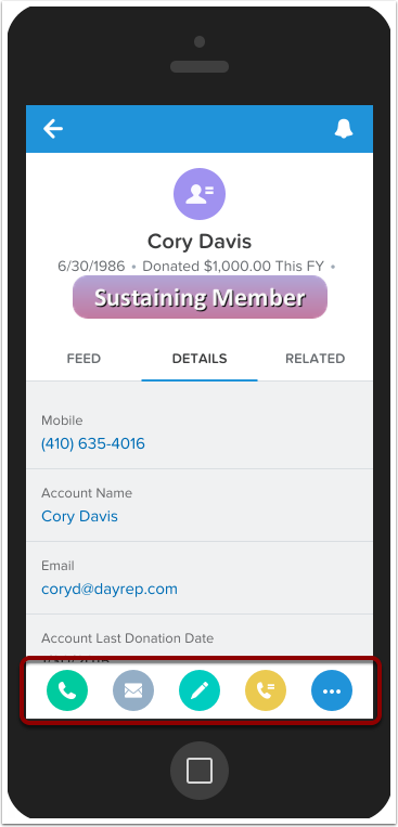
Action Bar
You’ve probable noticed that weird bar of icons at the bottom of the page. This is the “Action Bar”, and it’s how you can start to actually do things!
Actions To Take
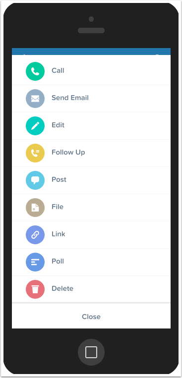
When you click the “…” icon, you’ll get a full list of what the actions are, and you can easily execute any one you want. You’ll notice that you can post to chatter, upload a file or photo, and even edit that contact!
One great thing about the mobile app is that when you @-mention someone in a Chatter post, if they use the app they’ll get a push notification about this. I’ve seen box officers use this technique to let a house manager know that a patron might need to be reseated. If you’re scanning tickets, you can use a Process Builder process to @-mention your Development Team whenever a major donor gets a ticket scanned. Then they’ll know they are here and ready to be met and stewarded.
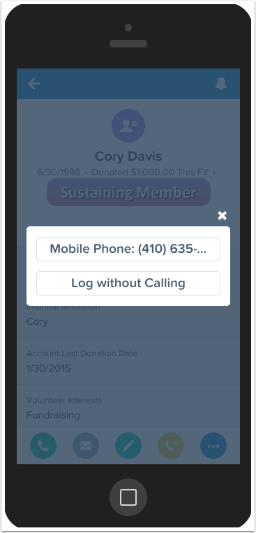
Call Action
A favorite is the call action, which when you tap it, will give you the option to use your mobile phone to actually call that patron! This will also log the call in Activity History, so you have a record of contacting them. If you already called them, or called them from a land line, you can select “Log without Calling” to just enter some notes about your conversation.
A Great Page Layout - Mobile
If there are actions for “Call” and “Email” right at the bottom of the page in the action bar, do you really need that information up at the top of your page layout? Nope! Here, we’ve re-arranged the layout once again to get really key information at the top.
A Great Page Layout - Desktop
This does make your desktop layout a little bit stranger, but it’s still pretty easy to find everything you need. Choosing a great page layout involves a bit of back and forth between desktop and mobile to make sure users of both platforms are happy and can do their job efficiently.
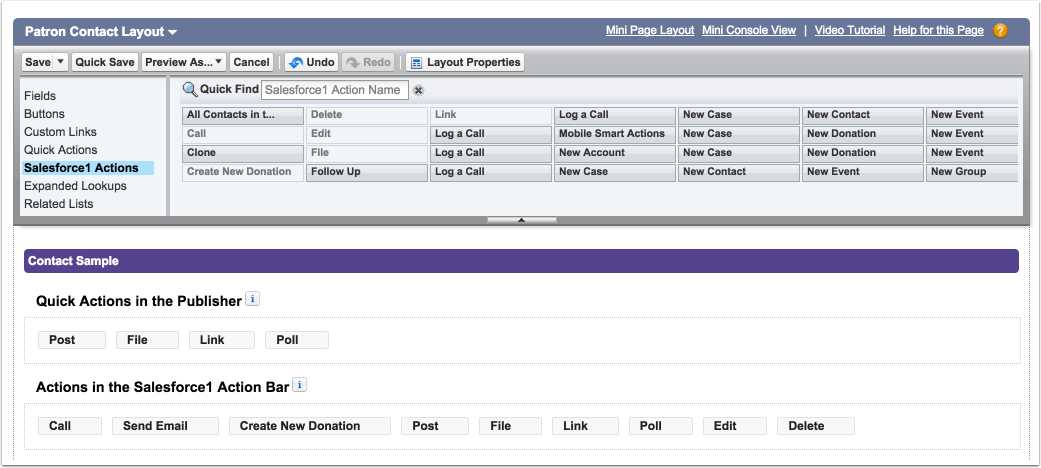
Customize Your Actions
Now that you’re seeing the information you want, it’s time to get a little bit more productive and customize the actions your users can perform from the mobile app. Once again, this will be done on the normal Page Layout. The first thing you want to do is override the standard action bar settings!
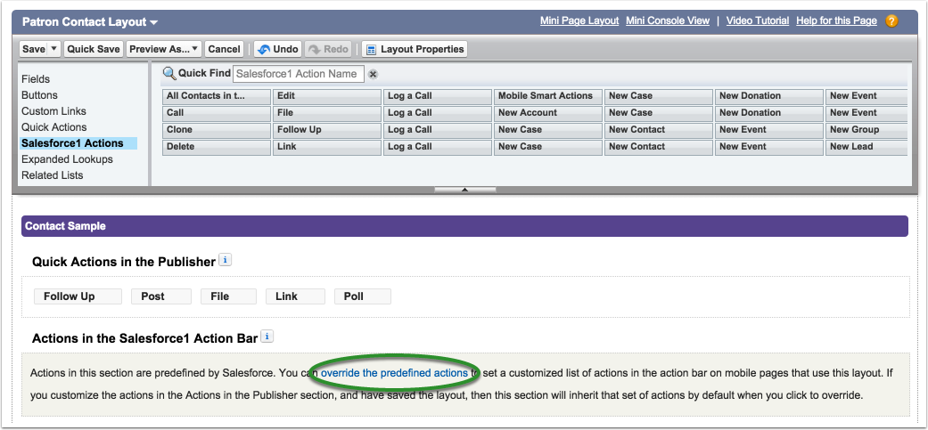
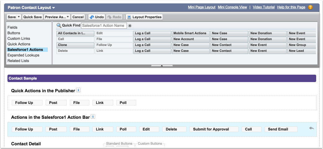
Hit the Override
Hit that link, and all of a sudden the action bar section is filled with the actions that were already there. You can remove ones you don’t need, and re-arrange as you see fit.
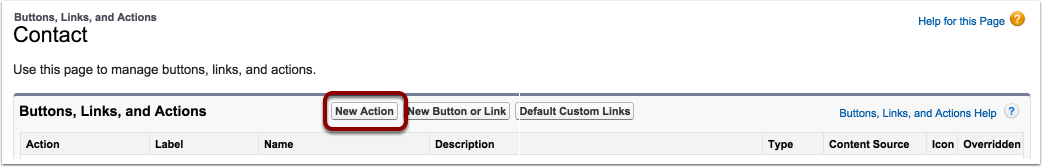
Create a New Action
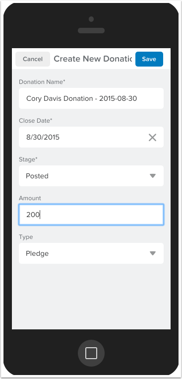
You can do a lot more than just those standard actions though! Navigate to the “Buttons, Links, and Actions” section of Contacts set-up, and let’s build an action to quickly create a new donation for a Contact.
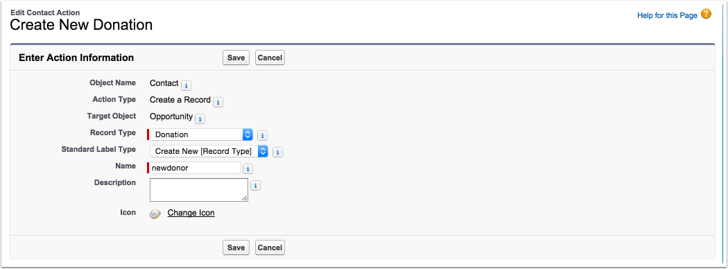
Give Your Action Some Basics
Once you hit “New”, you’ll start setting some details about the action. The target will automatically be “Contact”. Set the rest of the settings to match what I’ve done here. You can also choose a non-standard label type.
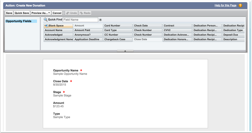
Set a Layout
Once you hit save, you’ll have to set a layout. I removed all non-important fields, so that your development officer in the field can quickly get to what she needs.
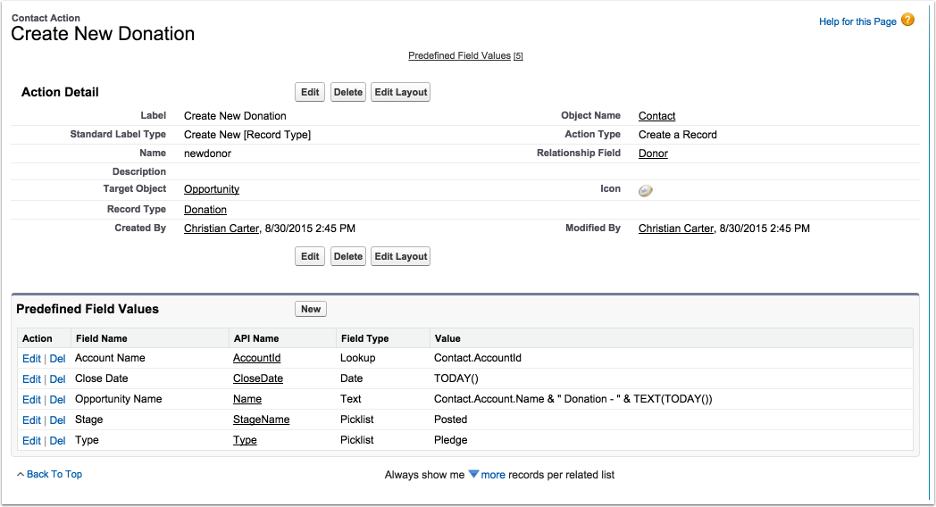
Set Predefined Field Values
After you set a layout, you get to set predefined fields. If you’ve built a custom button, you had to deal with URL hacks, but actions are much easier. For any field, regardless if it is required or not, and regardless if it is on your layout or not, you can set a default value. Here, we set the basics for what kind of donation this will be.
Add A New Action
Once it is saved, you can go back to your Contact Page Layout and add it to the action bar!
See it in Action
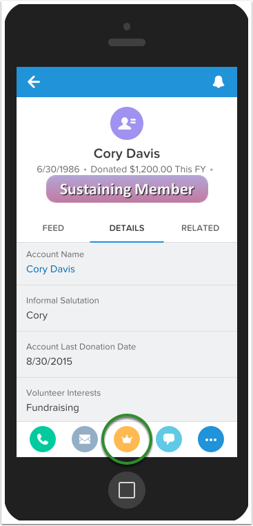
Check it out!
When you tap it, or access it through the “…” menu, it becomes very quick to add a new donation and save it. Once saved, you’ll pop right back to the contact, like nothing ever happened.
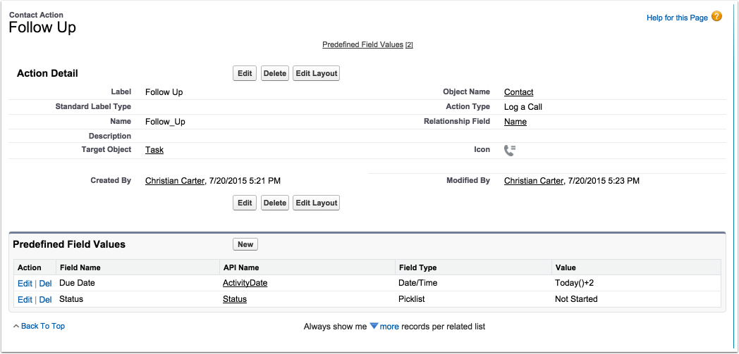
Follow Up Action
Caroline and I also built a “Follow Up” action. This is a great one for Executive Director’s who might meet a patron in the lobby before a show or at some event. We’ve set it up to create a new task, assigned to the current user and due two days in the future. Hitting it will allow your ED to quickly note that they need to send that patron an email to say hello, and they’ll have room to add a note like “We talked about the new eductaion program, send them more details about supporting it.”
This task can be re-assigned after, or you can set a Predefined Field Value to default the assignment to the executive assistant.
It’s very easy to change what an Action does, so make sure to build ones that are great for YOUR organization.
Wrap-Up
With all this done you’ve made a huge leap forward in making Salesforce1 useful for your organization. By using it to manage your contacts, your entire CRM becomes your mobile address book. It also makes it much easier for your ED to start entering details of conversations into the system. This will allow your team to all be on the same page about how a patron is being communicated.
But don’t stop there! Once you’ve got contacts looking beautiful, it’s time to start changing page layouts and compact layouts for Accounts, Donations, and more!
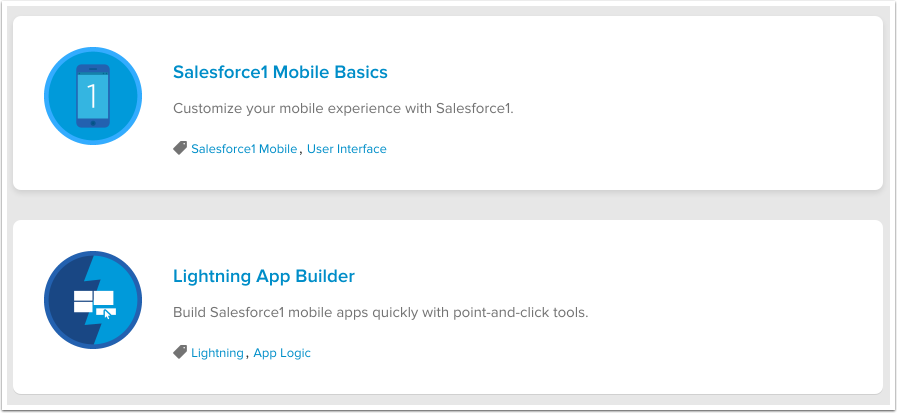
To find out more about what you can do with Salesforce1, I recommend these two Trailhead modules.
What’s Lightning?
Now, you may have heard or seen a little bit about “Lightning”, the next generation Salesforce UI. Just above, I recommended a Trailhead module about the Lightning App Builder!
Yes, it’s true, the Salesforce user interface is going to start changing, but I have some good news for you. The Lightning UI is based on the same technology that the Salesforce1 Mobile App is built on. So, if you start modifying Compact Layouts and Actions now, you’ll be set for success when the Lightning UI goes live.